IconButton
Overview
Constructor
Parameter
| Name | Type | Required | Description |
|---|---|---|---|
| options | Object | No | The object contains params of constructor. |
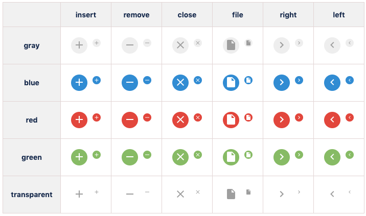
| options.color | String | No | Color of icon button:
|
| options.size | String | No | Size of icon button:
|
| options.shape | String | No | The shape of of button. The value is one of::
|
| options.type | String | No | The type of of button. The value is one of:
|
| options.isDisabled | Boolean | No | The icon button will be disabled. Default value: 'false' |
| options.isVisible | Boolean | No | The icon button will be visible. Default value: 'true' |
Sample
Javascript
var insertBtn = new kintoneUIComponent.IconButton({type: 'insert',color:'blue', size: 'small'});
React
import { IconButton } from '@kintone/kintone-ui-component';
import React from 'react';

export default class Plugin extends React.Component {
    render() {
        return (
            <IconButton type='insert' size='small' color='blue' />
        );
    }
}
Methods
render()
Get dom element of component.
Parameter
None
Returns
Dom element
Sample
Javascript
var iconBtn = new kintoneUIComponent.IconButton({type: 'insert'});
var body = document.getElementsByTagName("BODY")[0];
body.appendChild(iconBtn.render());
React
import { IconButton } from '@kintone/kintone-ui-component';
import React from 'react';

export default class Plugin extends React.Component {
    render() {
        return (
            <IconButton type='insert' size='small' color='blue' />
        );
    }
}
setColor(color)
Change color of icon button.
Parameter
| Name | Type | Required | Description |
|---|---|---|---|
| color | String | No | The size of of button. The value is one of:
|
Returns
None
Sample
Javascript
var iconBtn = new kintoneUIComponent.IconButton({type: 'insert'});
var body = document.getElementsByTagName("BODY")[0];
body.appendChild(iconBtn.render());
iconBtn.setColor('green');
React
import { IconButton } from '@kintone/kintone-ui-component';
import React from 'react';

export default class Plugin extends React.Component {
    render() {
        return (
            <IconButton type='insert' color='green' />
        );
    }
}
setShape(shape)
Change shape of icon button.
Parameter
| Name | Type | Required | Description |
|---|---|---|---|
| shape | String | Yes | The shape of the button. The value is one of:
|
Returns
None
Sample
Javascript
var iconBtn = new kintoneUIComponent.IconButton({type: 'insert'});
var body = document.getElementsByTagName("BODY")[0];
body.appendChild(iconBtn.render());
iconBtn.setShape('normal');
React
import { IconButton } from '@kintone/kintone-ui-component';
import React from 'react';

export default class Plugin extends React.Component {
    render() {
        return (
            <IconButton type='insert' shape='normal' />
        );
    }
}
setSize(size)
Change size of icon button.
Parameter
| Name | Type | Required | Description |
|---|---|---|---|
| size | String | No | The size of of button. The value is one of:
|
Returns
None
Sample
Javascript
var iconBtn = new kintoneUIComponent.IconButton({type: 'insert'});
var body = document.getElementsByTagName("BODY")[0];
body.appendChild(iconBtn.render());

iconBtn.setSize('small');
React
import { IconButton } from '@kintone/kintone-ui-component';
import React from 'react';

export default class Plugin extends React.Component {
    render() {
        return (
            <IconButton type='insert' size='small' />
        );
    }
}
setType(type)
Set the type of the button.
Parameter
| Name | Type | Required | Description |
|---|---|---|---|
| type | String | No | The type of of button. The value is one of:
|
Returns
None
Sample
Javascript
var iconBtn = new kintoneUIComponent.IconButton({type: 'insert'});
var body = document.getElementsByTagName("BODY")[0];
body.appendChild(iconBtn.render());

iconBtn.setType('remove');
React
import { IconButton } from '@kintone/kintone-ui-component';
import React from 'react';

export default class Plugin extends React.Component {
    render() {
        return (
            <IconButton type='insert'/>
        );
    }
}
on(eventName, callback)
Register callback for click event
Parameter
| Name | Type | Required | Description |
|---|---|---|---|
| eventName | String | Yes | Name of event:
|
| callback | function | Yes | callback |
Returns
None
Sample
Javascript
var iconBtn = new kintoneUIComponent.IconButton({type: 'insert'});
var body = document.getElementsByTagName("BODY")[0];
body.appendChild(iconBtn.render());

iconBtn.on('click', function(event) {
    console.log('on click');
});
React
import { IconButton } from '@kintone/kintone-ui-component';
import React from 'react';

export default class Plugin extends React.Component {
    render() {
        return (
            <IconButton type='insert' size='small' color='blue' onClick={this.handleClick} />
        );
    }
    handleClick() {
        console.log('on click');
    }
}
show()
Display the icon button.
Parameter
None
Returns
None
Sample
Javascript
var iconBtn = new kintoneUIComponent.IconButton({type: 'insert'});
var body = document.getElementsByTagName("BODY")[0];
body.appendChild(iconBtn.render());

iconBtn.show();
React
import { IconButton } from '@kintone/kintone-ui-component';
import React from 'react';

export default class Plugin extends React.Component {
    render() {
        return (
            <IconButton type='insert' size='small' color='blue' isVisible={true} />
        );
    }
}
hide()
Hide the icon button.
Parameter
None
Returns
None
Sample
Javascript
var iconBtn = new kintoneUIComponent.IconButton({type: 'insert'});
var body = document.getElementsByTagName("BODY")[0];
body.appendChild(iconBtn.render());

iconBtn.hide();
React
import { IconButton } from '@kintone/kintone-ui-component';
import React from 'react';

export default class Plugin extends React.Component {
    render() {
        return (
            <IconButton type='insert' size='small' color='blue' isVisible={false} />
        );
    }
}
disable()
Disabled the icon button.
Parameter
None
Returns
None
Sample
Javascript
var iconBtn = new kintoneUIComponent.IconButton({type: 'insert'});
var body = document.getElementsByTagName("BODY")[0];
body.appendChild(iconBtn.render());

iconBtn.disable();
React
import { IconButton } from '@kintone/kintone-ui-component';
import React from 'react';

export default class Plugin extends React.Component {
    render() {
        return (
            <IconButton type='insert' size='small' color='blue' isDisabled={true} />
        );
    }
}
enable()
Enabled the icon button.
Parameter
None
Returns
None
Sample
Javascript
var iconBtn = new kintoneUIComponent.IconButton({type: 'insert'});
var body = document.getElementsByTagName("BODY")[0];
body.appendChild(iconBtn.render());

iconBtn.enable();
React
import { IconButton } from '@kintone/kintone-ui-component';
import React from 'react';

export default class Plugin extends React.Component {
    render() {
        return (
            <IconButton type='insert' size='small' color='blue' isDisabled={false} />
        );
    }
}